Studio Notes · 7 October 2026
A responsive image should preserve meaning, not just fill the frame
A perfect grid can still publish the wrong picture. Treat cropping, art direction and alt text as editorial decisions before a responsive image reaches CSS.
By Juan Pablo Arce · 4 min read
In this article
- A frame can change the claim
- Separate fit, resolution and art direction
- Fit controls what the box does
- Resolution controls which file the browser loads
- Art direction controls which composition is used
- Decide what must remain before choosing CSS
- Accessibility starts with the image's purpose
- The counterpoint: cover is sometimes the right choice
- A five-view framing check
Websites ask one photograph to do several jobs. The same frame may appear as a wide homepage hero, a square card, a narrow mobile banner and a portrait-shaped social preview. That flexibility is useful, but it creates a quiet editorial risk: the layout can remove the very person, product detail or setting that makes the image accurate.
This is not simply a developer problem. It is a hand-off problem between the person choosing the image, the person designing the component and the person implementing it.
A frame can change the claim
The browser does not know which part of a photograph carries the meaning. It sees dimensions and a container.
MDN's definition makes the trade-off plain. object-fit: cover preserves the image's aspect ratio while filling the box, but clips anything that does not fit. object-fit: contain preserves the whole image, but can leave unused space when the image and container have different shapes.
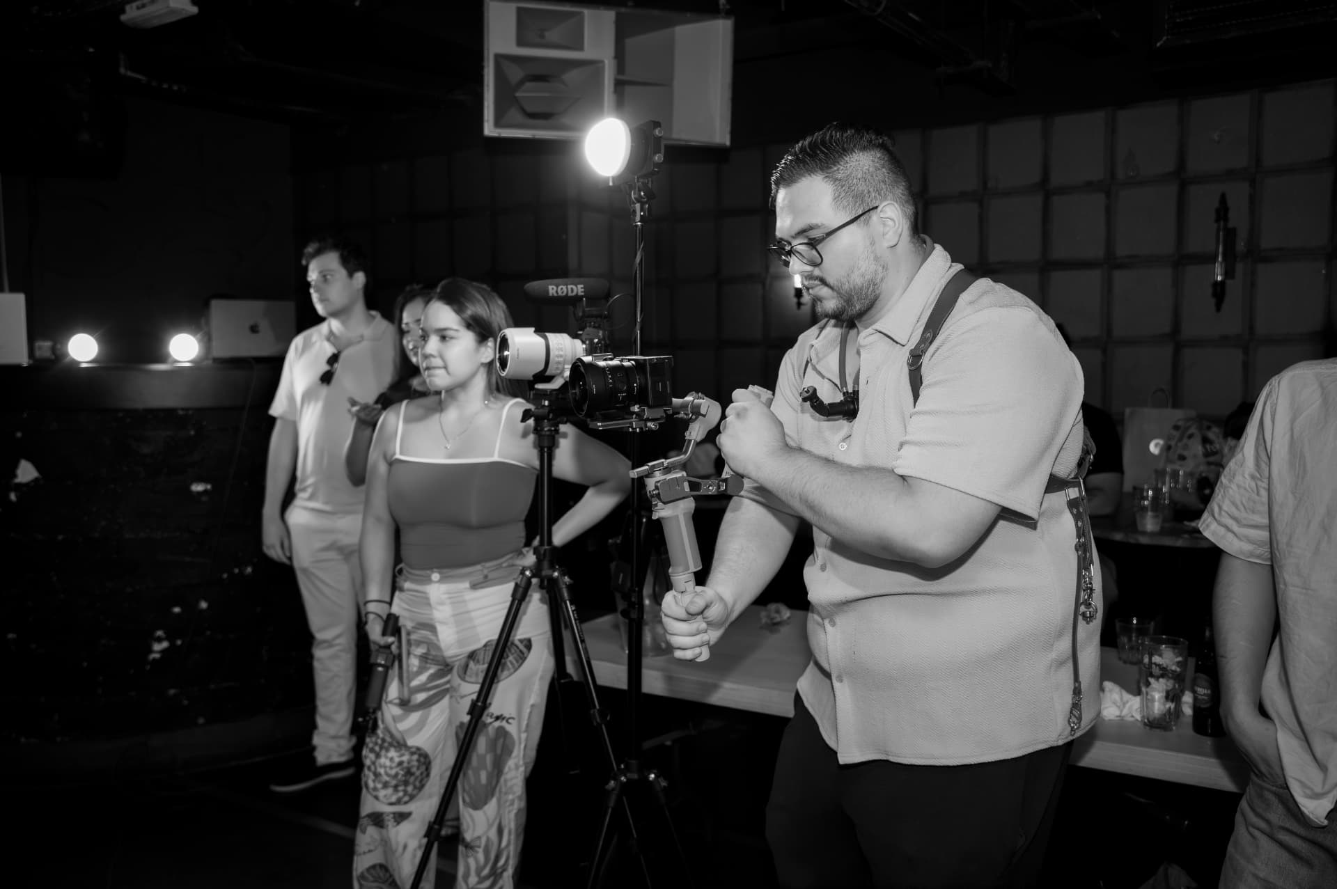
Neither choice is automatically correct. A product texture may tolerate a close crop; a team photograph may not. If a face, piece of work or environmental detail establishes who or what the image depicts, cropping it changes more than the composition. It changes the evidence.
Separate fit, resolution and art direction
These decisions are often bundled together, although they solve different problems.
Fit controls what the box does
cover, contain and object-position describe how one image sits inside one box. They are presentation rules. Moving the focal point with object-position may rescue one subject, but it cannot preserve two people placed at opposite edges if the box is too narrow.
Resolution controls which file the browser loads
srcset and sizes let the browser choose an appropriately sized version of the same image. This can reduce unnecessary downloads on smaller screens without changing the scene. Resolution switching is a performance decision, not permission to reframe the story.
Art direction controls which composition is used
The <picture> element can supply a deliberately prepared alternative for a different viewport. MDN calls this the art direction problem: a wide scene may work on desktop while a tighter composition makes the important detail legible on mobile. That alternative still needs human approval. It should not be an automatic centre crop that happens to pass a visual test.
Decide what must remain before choosing CSS
The useful question is not “cover or contain?” It is “what is this image required to prove?”
For each image, write a short framing note:
- Role: hero, evidence, portrait, product detail or atmosphere.
- Non-negotiable subject: the faces, object, action or setting that must remain visible.
- Crop permission: no crop, safe crop within named boundaries, or approved alternatives by breakpoint.
- Fallback: neutral margins, a different asset or a text-only layout.
This note turns visual preference into an implementable rule. It also gives the reviewer something specific to approve.
Accessibility starts with the image's purpose
Framing and alternative text are connected because both depend on editorial intent. W3C guidance distinguishes informative images from decorative ones: a decorative image should normally use an empty alt attribute, while an informative image needs text that conveys its purpose in context.
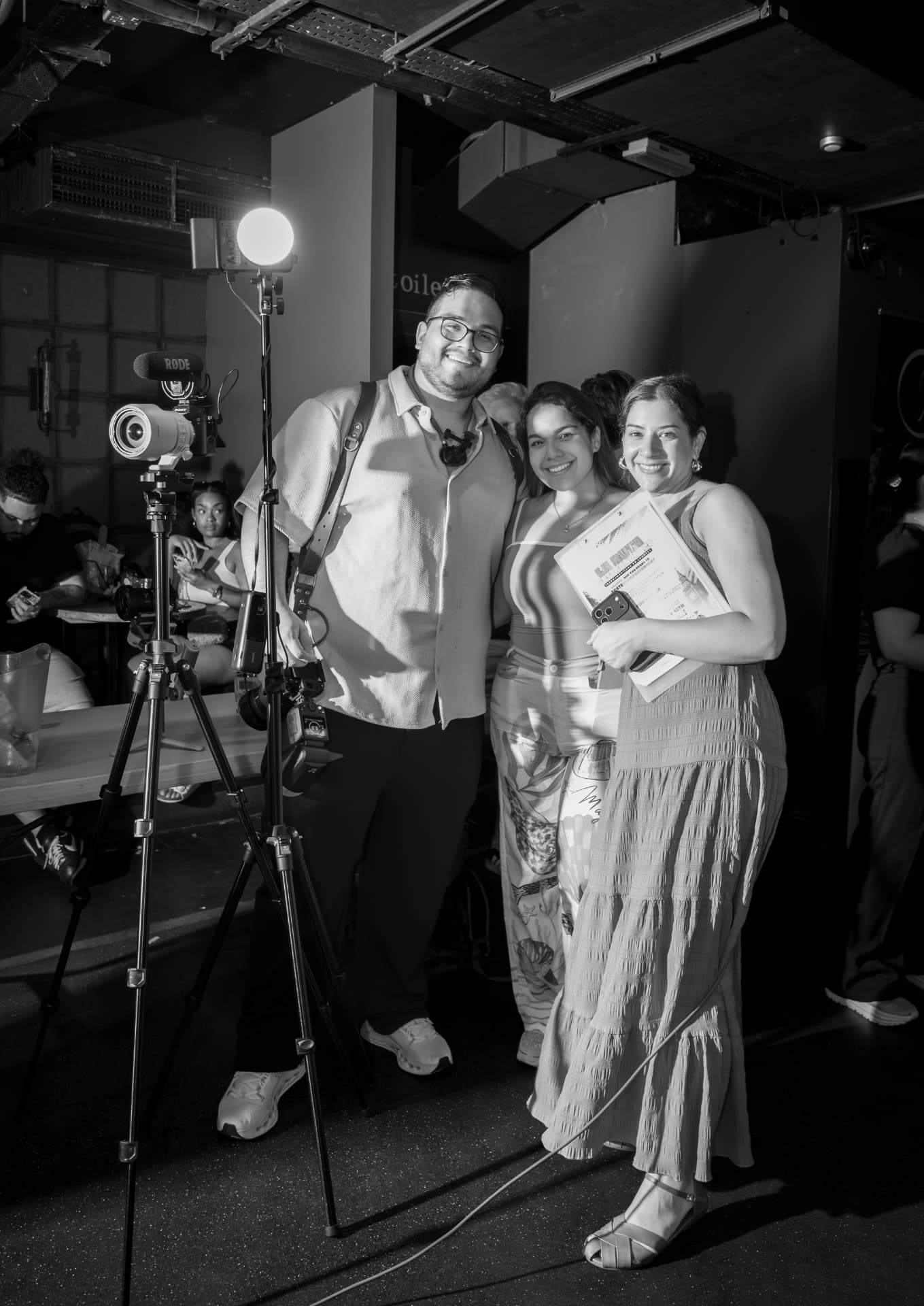
If the layout removes the subject described by the alt text, the visual and accessible versions contradict each other. Review them together. A technically present description does not repair a misleading crop.
The counterpoint: cover is sometimes the right choice
Whole-image containment is not a universal design rule. It can create awkward margins, reduce impact and make a small subject harder to recognise. A controlled crop can be clearer when a focal subject is known, the crop has been approved and every breakpoint has a suitable composition.
The mistake is not using cover. The mistake is letting a generic component make an editorial decision without a record of what may be removed.
A five-view framing check
Before publication, review the real asset in at least five places: desktop hero, desktop card, mobile hero, mobile card and social preview. Confirm three things in each view: the required subject remains visible, no head or product detail is lost, and the alt text still describes what is actually shown.
Then make one explicit business decision: either accept the crop, supply an approved alternative, or change the layout to preserve the whole frame. Empty space is often cheaper than an image that says the wrong thing.
Sources
- MDN — object-fit CSS property (last modified 21 July 2026) · 2026-07-21
- MDN — Using responsive images in HTML (last modified 6 November 2025) · 2025-11-06
- W3C WAI — Decorative Images (updated 27 July 2019) · 2019-07-27
- The Creative Design UK authorised studio archive — trabajando_ambos.jpg (uploaded 29 July 2026) · 2026-07-29
- The Creative Design UK authorised studio archive — trabajando_ambos_3.jpg (uploaded 29 July 2026) · 2026-07-29
0 likes
0 comments
Working on something this applies to? Tell us.
Start a project