Case study 07 · AMARTE Artisan Bakes
Colombian baking, expressed through a complete visual identity.
The studio's first branding project: a full visual identity and packaging system for a Colombian artisan bakery brand founded by Martha Mulett.
- Client
- AMARTE Artisan Bakes
- Sector
- Food and drink
- Location
- London
- Scope
- Branding
The challenge
Colombian artisan baking carries warmth, family and cultural character that a UK shelf rarely explains on its own. AMARTE needed an identity that could hold that character and still work as a product people meet for the first time in a British setting.
Our approach
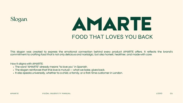
We built the brand from its own language outwards. The name already means “to love you” in Spanish, so the slogan, the palette, the typography and the packaging all work from that idea of food made with care — warm rather than nostalgic, clear rather than decorative.
What we delivered
- AMARTE wordmark
- Brand slogan — “Food that loves you back”
- Primary and secondary colour system
- Typographic system across ETNA, Touvlo and Arimo
- Visual identity manual
- Packaging artwork and layout routes
- Brand applications across bags, aprons and boxes
The logo and the packaging
The wordmark with its slogan, and the finished pouch artwork for two products.
Logo presentation — wordmark and slogan 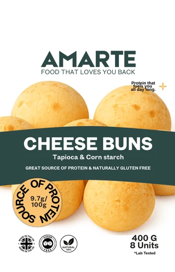
Packaging artwork — pouch, green route 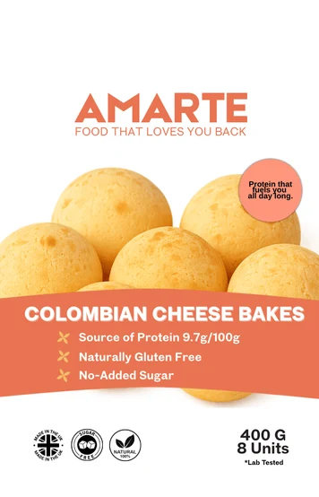
Packaging artwork — pouch, terracotta route
What the work produces
- One manual the brand can hand to a printer, supplier or collaborator
- Finished pouch artwork for two products, ready for a printer
- A wordmark and slogan that carry across every application
The brand now has one consistent visual language, from the wordmark through to the pouch on a shelf.
Related projects
Related capabilities