Studio Notes · 12 September 2026
A better website brief starts with the work behind the screen
Public websites, online shops and internal applications solve different problems. Three examples from our work show why the brief should start with the task, the user and the evidence of success.
By María José Ospina · 4 min read · Updated 14 September 2026
In this article
A customer looking for a property and a colleague checking a property's costs may be dealing with the same business. They need different information, different permissions and different ways to judge whether a screen has helped them.
That distinction can disappear in a website brief. A list of pages, colours and features makes a project look well defined while leaving its purpose unresolved. The consequence is a familiar design risk: an attractive interface with no agreed test for whether it works.
One business can need several different digital experiences
Our work with BlueHome includes property content and marketing, alongside an application covering properties, costs, income and expense reporting and internal administration. Those are confirmed areas of the project. They do not establish how much time the application saves or what return it generates.
The distinction matters when briefing the work. A prospective customer needs to understand an offer and find an appropriate next step. Someone reviewing an expense needs enough context to decide whether the record is correct. Giving both users more information is not automatically helpful; the relevant information changes with the task.
For a hypothetical property application, a useful test might ask a colleague to locate an expense, identify the property it belongs to and explain what the report includes. That is a proposed evaluation method, not a description of BlueHome's current workflow or a result we have measured.
An online shop has a different organising problem
For La Amazonas, the owners report that the webshop we built contains more than 1,000 products and is receiving online orders. The public shop provides a visible example of the commercial side of this work. The catalogue size is owner-reported scope; no revenue or conversion uplift is claimed here.
At that scale, a brief needs to address how people find and distinguish products. A returning customer who knows an exact name may use the site differently from someone exploring an unfamiliar ingredient. Product naming, categories and explanations should be tested against those journeys.
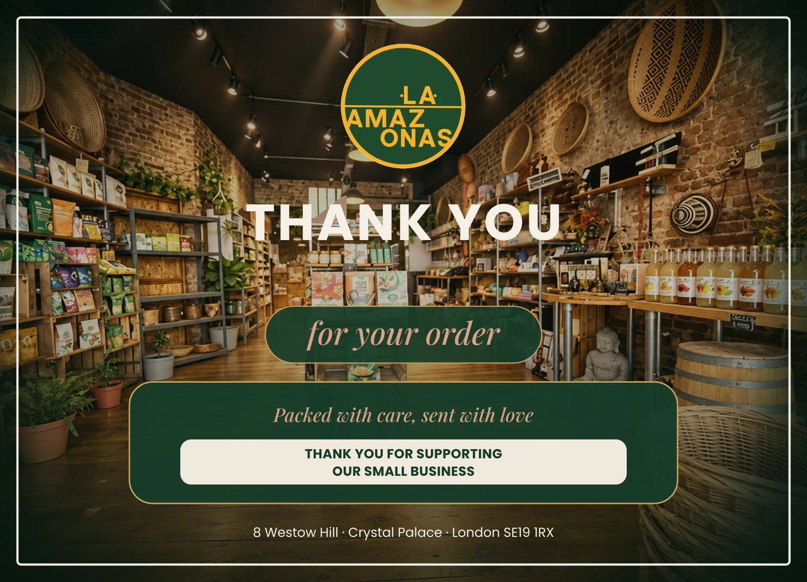
The relationship also continues beyond the checkout. The order-card artwork below is one example of our design work for La Amazonas. It illustrates a customer communication touchpoint; it is not a photograph of the shop or evidence of fulfilment performance.
Operational scope needs a clear boundary
Urbanos y Terrestres del Valle SAS, in Colombia, is a related business owned by our co-founder Juan Pablo Arce. Our work includes a website and administrative applications covering trips, fleet, trailers, personnel, maintenance and financial and operational reporting.
That range of functions makes prioritisation important. It does not tell us that every function belongs on one screen, that every system is integrated, or that a custom application is always the best answer.
Our recommendation is to identify a complete, bounded task before expanding the feature list. Specify the information required, who can change it and what should happen when information is incomplete. A simple task that is reliable is a better foundation for evaluation than an extensive demonstration that only covers the ideal case.
Write the acceptance test before choosing the interface
The UK Government's Service Manual guidance on user needs recommends learning what people are trying to achieve and grounding those needs in research. Although written for public services, it offers a useful discipline for a small business brief.
For each proposed journey, write down:
- Person and purpose: who needs to do what, and why?
- Evidence needed: what information lets them make the decision?
- Correct outcome: how will the team recognise successful completion?
- Exception: what should happen if a record is missing or an action fails?
- Ownership: who maintains the information and reviews the experience?
Then watch representative users attempt the task. Record where they need help, misunderstand a label or reach an incorrect result. Agree the observation window and comparison before turning those observations into performance claims.
AI changes development, not accountability
We use human-directed, AI-assisted development. An initial version can help make requirements tangible, but a convincing demonstration is only one stage of the work. People still need to check calculations, access, error handling and whether the tool reflects the business accurately.
Custom software also brings maintenance responsibilities. For a simple, well-served requirement, an existing product may be a more proportionate choice. The briefing process should leave that option open.
For your next digital project, choose one important user task and write its acceptance test before requesting a visual concept. That gives the designer a purpose, the developer a boundary and the business a concrete way to judge the result.
Editorial note: revised on 14 September 2026. Client scope is based on owner-confirmed project information; evaluation examples are recommendations, not measured client outcomes.
Sources
Related work
Working on something this applies to? Tell us.
Start a project